
Years of experience in coffee preparation often emphasize perfecting grind size and water quality, with the assumption that precise chemistry guarantees the ideal flavor. Yet neuroscience reveals a more complex story: our perception of taste begins even before coffee touches the tongue.
One of the strongest influences comes from visual cues. Color, presentation, and appearance can shape our expectations and enhance the perceived flavor, showing that the experience of coffee is as much psychological as it is chemical.
Cross-modal perception occurs when the brain combines information from different senses to create a unified experience. In the case of coffee, the color of the vessel (the mug or cup) acts as a visual prime. It sets an expectation of sweetness, acidity, or intensity. If you change the color of the mug, you change the sensory profile of the coffee itself. This is not a placebo effect; it is a measurable change in how the brain archives and interprets flavor.
The Blue vs. White Experiment: A Classic Lab Study
A famous study conducted in 2014 by researchers in Australia and the UK (Spence et al.) laid the groundwork for our understanding of coffee color psychology. In the “Sensory Laboratory,” we have replicated these findings:
-
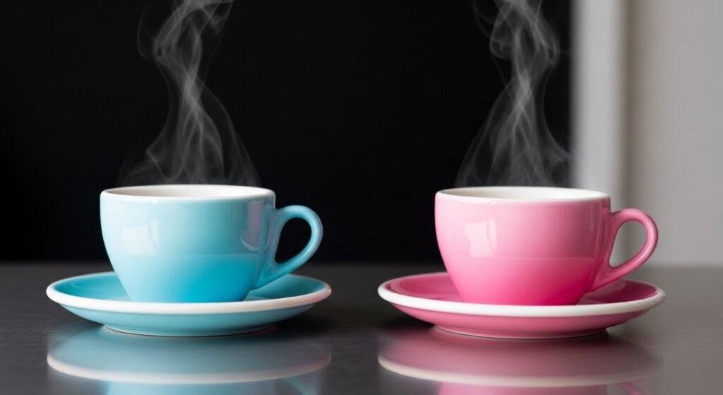
The White Mug (The Intensity Anchor): Coffee served in a white mug is consistently rated as more “intense” and “bitter.” This is because the white background provides a sharp visual contrast to the dark brown liquid. The brain interprets this high contrast as a signal of high concentration and strength.
-
The Clear Glass (The Transparency Bias): In clear glass, the coffee is perceived as “lighter” and “weaker.” This is ideal for showcasing the delicate mouthfeel of a tea-like high-altitude Ethiopian coffee, but it can make a dense espresso feel under-extracted.
-
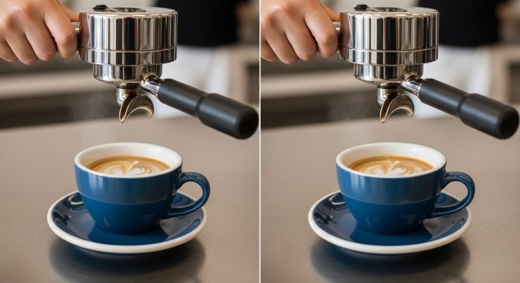
The Blue Mug (The Sweetness Trigger): Blue is often associated with calmness and, paradoxically, sweetness in the context of beverages. In blind trials, the same coffee served in a blue mug was rated as significantly sweeter than when served in a white mug.
Deconstructing the Color Palette of the “Sensory Laboratory”
Each hue on the color wheel triggers a different neuro-chemical response on the barista’s bench.
Red: The Stimulant
Red is a high-energy color. It is associated with ripeness and heat. When drinking from a red cup, the heart rate can subtly increase, and the brain expects a “bold” or “spicy” flavor. This is an excellent choice for high-altitude coffees that feature notes of red berries or cinnamon.
Pink: The Sweetness Illusion
Pink is the ultimate primer for sweetness. Because our brains associate pink with candy and berries, it can actually suppress the perception of astringency. If you have a coffee that is slightly over-extracted, serving it in a pink or pastel-toned cup can help “round out” the aftertaste.
Green: The Acidity Amplifier
Green is the color of nature, but also of under-ripe fruit. Serving coffee in a green cup can enhance the perception of “brightness” and citrus acidity. For a Kenyan coffee with high malic acid (apple-like notes), a green vessel can make those notes pop with more clarity.
Yellow: The Warmth Factor
Yellow is associated with sunshine and joy. In the “Sensory Laboratory,” we’ve found that coffee in yellow cups is often perceived as “hotter” in temperature than coffee in blue cups, even if the liquid is at the same $65^\circ C$.
The Physics of Contrast: Why Saturation Matters
It’s not just the hue; it’s the saturation and luminance.
-
High Saturation: A neon orange cup will overwhelm the aroma wheel. The brain becomes “distracted” by the visual noise, which can actually decrease the ability to detect subtle flavor nuances.
-
Low Saturation (Pastels): These are the favorites of specialty cafes. Earthy tones, terracotta, and soft greys allow the brain to focus more on the mouthfeel and body of the coffee without visual interference.
In the lab, we use a concept called “Fluorescence”. Some ceramic glazes have fluorescent properties that react to the lighting in your cafe. This can shift the perceived color of the coffee’s “crema,” making it look more golden (desirable) or more ashy (undesirable).
Barista’s Bench: Choosing the Vessel for the Bean
As a professional barista, you should treat the cup as a “Flavor Modifier.” When you perform your espresso calibration, consider the final presentation:
-
For a Nutty/Chocolatey Brazilian: Use a deep blue or teal cup to emphasize sweetness and lower the perceived bitterness of the roast.
-
For a Floral Panamanian Geisha: Use a thin, transparent glass or a very light pink ceramic. The visual “lightness” will match the delicate aromatic profile.
-
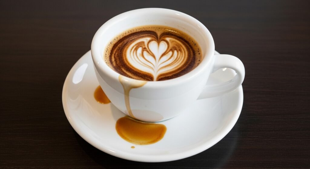
For a Traditional Espresso Blend: A thick-walled white ceramic cup is best. It reinforces the “intensity” that traditional espresso drinkers expect.
Maintenance of the Visual Experience
Just as maintenance of your grinder is vital, the maintenance of your vessels is critical for color psychology.
-
Staining: A white cup with brown coffee stains on the bottom sends a signal of “bitterness” and “dirtiness” to the brain. This can ruin the aftertaste before the coffee is even finished.
-
Texture: The physical texture of the cup (matte vs. glossy) also plays a role. A matte-textured cup can make the mouthfeel of the coffee feel more “velvety,” while a glossy cup emphasizes “clarity.“
The Future of “Smart Mugs”: Chromatic Tuning
In the “Sensory Laboratory,” we are exploring the future of “Chromatic Tuning.” Imagine a cup that changes color as the coffee cools. Since sweetness becomes more apparent at lower temperatures ($50^\circ C – 55^\circ C$), a cup that shifts from white to pink as it cools could theoretically track the flavor development of the coffee in real-time. This is the ultimate integration of water quality, physics, and psychology.
Conclusion: The Final Layer of Flavor
We are not just drinking a liquid; we are experiencing a multisensory event. The aroma, the mouthfeel, and the aftertaste are all filtered through the lens of what we see.
In the “Sensory Laboratory,” we respect the science of grinding and the secrets of high altitude, but we must also respect the brain. By choosing the right cup color, you can subtly “tune” your coffee to perfection. Keep your equipment maintained, your water filtered, and your visual presentation as precise as your espresso calibration. The perfect cup of coffee is a masterpiece of both chemistry and psychology.

Kevin Smith is deeply interested in the craft and culture of coffee, with practical experience exploring specialty beans, brewing techniques, and flavor development. Over the years, he has spent time studying preparation methods, observing extraction processes, and understanding how small details influence the final cup.
Through NovaWeHub, Kevin shares clear, practical, and research-based insights designed to make coffee knowledge approachable for everyone — from beginners to enthusiasts. His focus is on simplifying complex concepts and encouraging readers to explore coffee with curiosity, confidence, and a more refined sensory awareness.